Variants are alternate implementations of a component that are designed to meet the needs of diverse use cases in an experience. While each component is likely to have unique variants, there are a handful of standard variants that will need to be considered and accounted for as part of the holistic design process of each component.
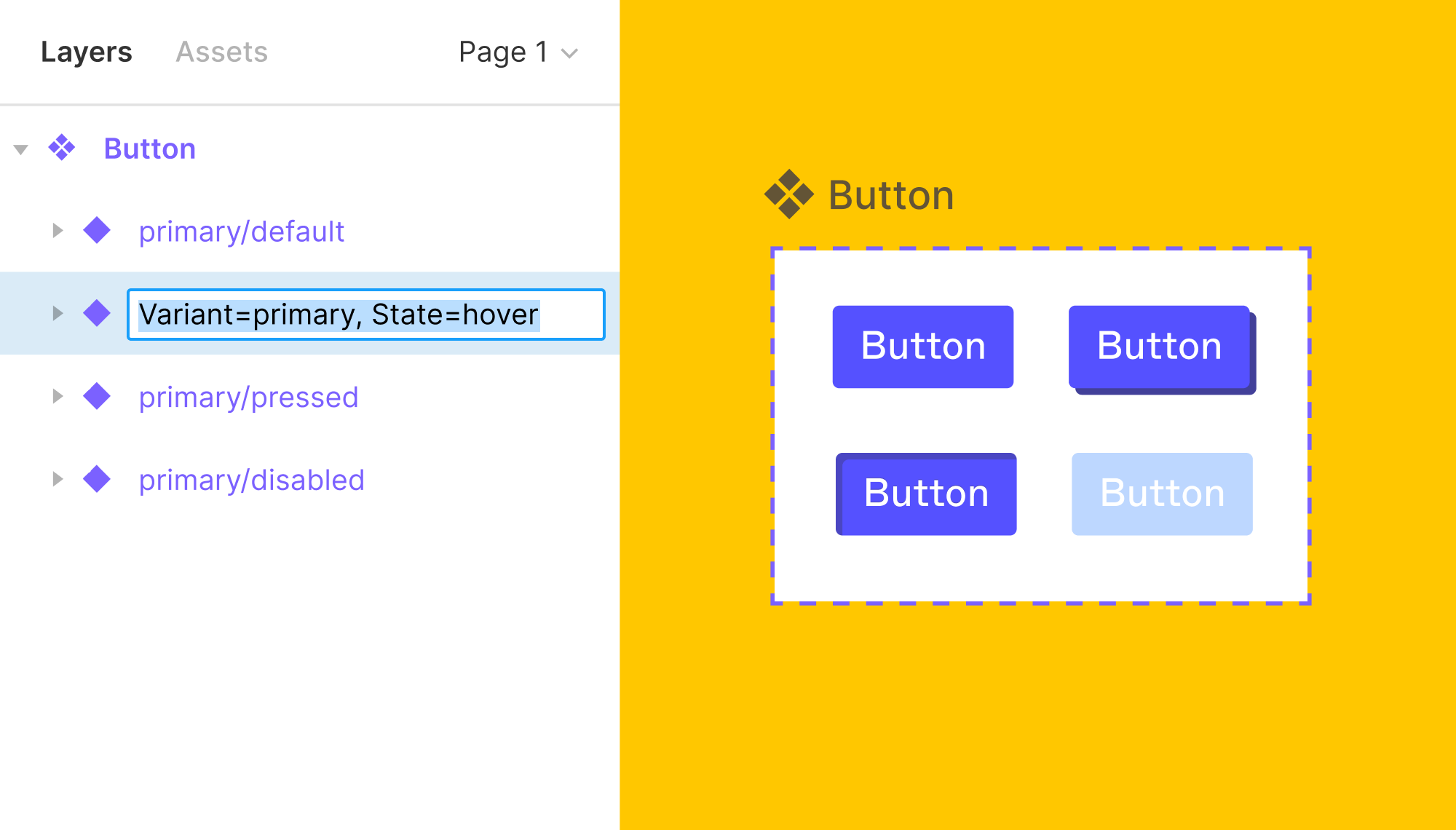
Variants are implemented in Figma by using properties and a corresponding value in the variant layer name: Property=Value : State=Resting Variants can and should have multiple custom properties to support the modifiers needed for our robust experiences.
Some variants will have properties that are a choice between one of two options for the property. When this is the case, Figma allows the property’s value to be set to True / False instead of a custom value. This results in a toggle switch for the variant that can be used to turn elements of a component on or off. True / False values are often used to toggle a component’s Loading state on or off, but there are other applicable use cases where the True / False values for properties are more appropriate than custom values.
Interactive experiences have a variety of states that occur as users engage with them. These states are conditions that necessitate a change in the display of the interface elements. Our design work should account for these states as they apply to the scope of what is being designed. While some states will not be applicable in specific cases, most of what we design will need to account for these states.
Render States
| State | Definition |
|---|---|
| Blank | There is no content to display to the user because they have not engaged with the feature to have content to display. This state often occurs during first-time use. |
| Loading | Content is not displayed because it has not finished processing the request. |
| Complete | Content is displayed. |
Control States
| State | Definition |
|---|---|
| Resting | The control is able to receive input or action. |
| Active | The control received input or action and is selected. |
| Inactive | The control is not able to receive input or action (this is often referred to as disabled, but we avoid the term as it rooted in ableism.) |
| Hover | The pointer (cursor) is actively positioned above the control. |
| Focus | The control is selected and able to receive keyboard input or action. |
| Pressed | The interstitial presentation of the control when it receives user input or action but the user has not yet released their input (before mouse up, key up, or tap release). |
| Visited | The control (links only) has been viewed by the user. |
Feedback States
| State | Definition |
|---|---|
| Error | The action or request could not be completed. |
| Success | The action or request was completed successfully. |